2003 American League
All data in these graphs as of season endYou can also view these related graphs:
| American League East |
AL as of May 4th |
AL as of August 2nd |
| American League Central |
AL as of May 25th |
AL as of August 23rd |
| American League West |
AL as of July 1st |
AL as of September 13th |

|
| ||||||||||||||||||||||||||||||||||
| Team | Runs +/- |
| ANA | 0.01 |
| BAL | 0.10 |
| BOS | -0.12 |
| CHA | -0.07 |
| CLE | 0.03 |
| DET | -0.20 |
| KCA | 0.28 |
| MIN | -0.06 |
| NYA | -0.13 |
| OAK | 0.14 |
| SEA | 0.03 |
| TBA | -0.02 |
| TEX | 0.00 |
| TOR | 0.22 |
| Comments | How to Read this Graph |
|
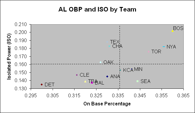
I've made a slight change to this graph. I'm now using ISO instead of SLG to better distinguish teams from each other. You can see that this graph is a lot more revealing than previous graphs. Seattle has a clear ISO weakness that must be addressed to improve their offense. The irony is that the leaders of the OBP movement, the Oakland Athletics, actually had better slugging in 2003. The need for the White Sox and Rangers to improve their OBP is clear, too. Slugging is good, but it's better with men on base. Kansas City had a phenomenal run of luck when converting its run elements into actual runs. They did it by batting .304 with men in scoring position. Conversely, the Tigers' offense had the worst luck at converting runs; they batted .228 with runners in scoring position. | |

|
New Graph!I'm converting to some new graphing software (look for big changes next year) and I've reconstructed this graph to try and incorporate some of the most recent analysis regarding pitching and fielding. For more information, click on the "How to Read this Graph" link. | ||||