2003 American League

All data in these graphs as of September 13
You can also view these related graphs:
American League East
AL as of May 4th
AL as of August 2nd
American League Central
AL as of May 25th
AL as of August 23rd
American League West
AL as of July 1st

Runs Scored and Allowed

Comments How to Read this Graph
August 24, 2003
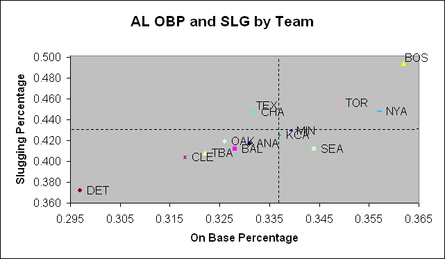
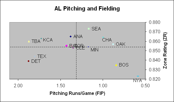
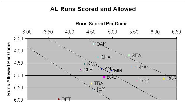
If you flip through the graphs from earlier in the season (try the above links; it's fun to do) you'll see that there really hasn't been a lot of movement among the league's top teams, outside of New York's fantastic start and the Red Sox recent offensive slide.

Among other teams, however, you can see the White Sox improve their standing both on offense and defense. Minnesota has stabilized after a horrid June and Texas has been climbing out of the cellar. Somehow, the Tigers have managed to avoid falling off the graph altogether. To add insult to injury, they also have the biggest deficit against their Pythagorean projection.

Team Wins +/-
ANA -4.81
BAL -3.79
BOS -0.89
CHA -1.25
CLE -2.28
DET -3.82
KCA 3.24
MIN 3.09
NYA 5.81
OAK 0.90
SEA -4.05
TBA -3.74
TEX 3.82
TOR -2.08


OBP and SLG by Team
Team Runs +/-
ANA 0.02
BAL 0.10
BOS -0.08
CHA -0.18
CLE -0.03
DET -0.29
KCA 0.24
MIN -0.08
NYA -0.08
OAK 0.13
SEA 0.06
TBA -0.01
TEX -0.02
TOR 0.19


Comments How to Read this Graph
August 24, 2003
I decided to stretch this graph to fit in Detroit. It makes for a bunched up middle, but at least you can now see the stark difference between the offenses on display in Detroit and Boston. To add insult to injury, Detroit's offense is actually .32 runs/game worse than its combined run elements.

In addition to being the luckiest "pythagorean" team in the League, the Royals are the luckiest "run elements" team, too. I keep thinking something's got to give. Toronto's positive run differential is also worth noting; their basic offensive elements aren't as close to Boston's as the first graph indicates. By the way, if you combined Texas' slugging with Seattle OBP, you'd have an offense as good as Toronto's.


Pitching and Defense

Comments How to Read this Graph
August 24, 2003
Teams that are helped the most by the move from DER to Zone Rating are Toronto and Baltimore. The ones most negatively impacted are the Red Sox and A's.

Yankees: best pitching and worst fielding. Red Sox: second-best pitching and second-worst fielding. Really, this is pretty amazing. Seattle continues to have very, very good fielding (followed by Anaheim), while the fielding of the Royals and Devil Rays is hidden by their poor pitching.

Graph Change

Thanks to a suggestion from a faithful reader, I have changed the parameter for the defense portion of this graph from Defense Efficiency Ratio to Zone Rating. Zone Rating, which is computed by Stats and is available on the ESPN website, is the number of batted balls successfully turned into outs divided by the number of balls that are hit into "fieldable" zones. As such, it is a cleaner measure of fielding than DER.